01View project
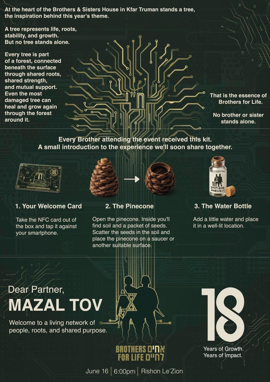
Brothers for Life18 years event
Branding & Design · Strategy & Creative · Event identity · print
05 / 06Services
Identities built to be remembered.
Brand identity, visual systems and design for every touchpoint, from logo and typography to packaging, event materials and exhibition stands.
An identity proves itself in use: on a label, a stand, an invitation, a screen. We design systems that hold together across all of them, and we test them there before handing them over.
For a company, a consistent identity is recognition you don’t pay for twice: every label, stand and post adds to the same memory instead of starting a new one.
A logo is a signature. A brand is everything it signs.
The core signature, with versions for every size and background.
Typefaces and a palette that work in Hebrew and English, print and screen.
Imagery, illustration, icons and layout rules.
A clear, usable guide for your team and suppliers.
Presentations, social posts and documents ready to use.
Brochures, signage, invitations and campaign design.
An event identity carried from the kit card to the venue map.
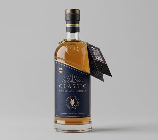
A label that has to sell from the shelf.
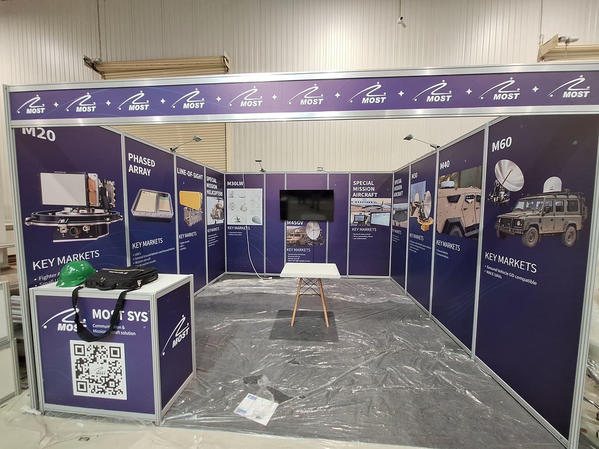
A brand at architectural scale, read from across the hall.
01
The brand's story, audience, competitors and where it will appear.
02
Two or three design directions, shown in real applications.
03
The chosen direction refined into a complete system.
04
Files, guidelines and the first applications, ready for production.
Often, yes. Many brands need a stronger system around an existing mark rather than a new one. We'll tell you honestly which it is.
Yes. Typography and layout are chosen to work in both directions, so the identity looks equally strong in each language.